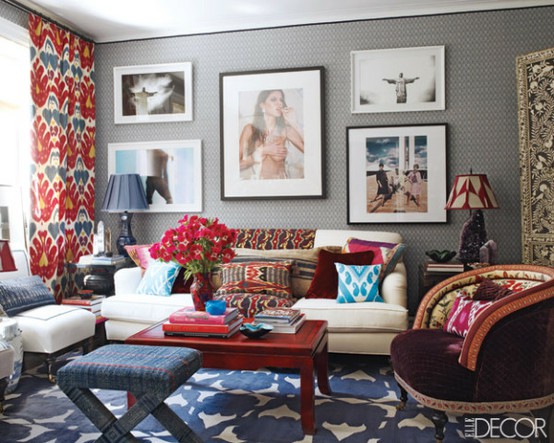
For me, the simple key to layering patterns is contrast. Patterns must either have:
contrast in scale
- AND/OR-
- AND/OR-
contrast in movement
(for instance a geometric + an organic pattern - a floral with a stripe is the most classic example!)
Here are some lovely examples of the rules at work. . .
Here are some lovely examples of the rules at work. . .
A perfect example of how a small scale geometric goes wonderfully with a larger scale organic floral!
Ok, this is the master class! I know it looks a bit like chaos and the look might not be for everyone but I love its energy! And the rules of pattern are still working here too - very small scaled prints contrast with larger ones {like the bold rug} and geometrics {like the red lampshade and wall fabric} help reign in all of those ethnic prints!
Also, a reminder that pattern does not have to mean a bold, over the top animal print or crazy chintz - soft patterns can often be the prettiest!
So what do you think, are you up to layering pattern?
So what do you think, are you up to layering pattern?
{via}


No comments:
Post a Comment