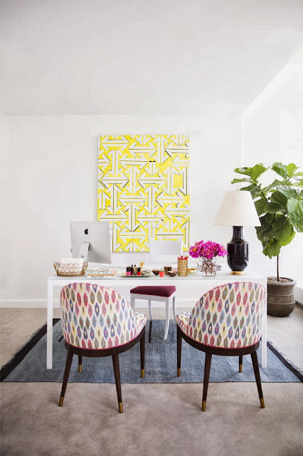
Today I am so inspired by the amazing office of Lucky editor Eva Chen featured in the new Domino {it's a bit different than the original shelter mag which folded 4 years ago and is more of an online shop, but I am still thrilled they are back!} Offices can end up so sterile and utilitarian but Chen's work space oozes layered sophistication and charm. It feels so personal and lovely yet also so professional - a perfect balance!
Here's why it works:
{1} Modern office pieces (like the glossy white desk) are paired with vintage elements (like those fantastic midcentury visitors chairs) for a wonderful juxtaposition.
{2} The color palette is overall muted and monochromatic with just a few pops of vibrant pink, lemon yellow and cornflower blue for a bolt of energy.
{3} Metallic elements throughout lend a bit of modern glamour and prevent the space from feeling flat.
I could certainly work here! How about you?
{images via Domino here}


1 comment:
Beautiful set of photos. I've been wanting that rug for a while now….maybe for Christmas!
Post a Comment