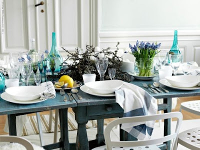
IKEA furniture is everywhere! I think because it is super well priced, easily accessible, and well, it just does the job. The bad news is we have all seen it look downright cheap and boxy. The good news is IKEA has a beautifully styled blog to help us envision these mass produced pieces look unique. It's overflowing with lovely images of IKEA furniture in charming and stylish interiors! It is written in Swedish but the google translate bar at the top can fix this. The key is the mix of the old and the new and of course not using too much IKEA furniture in one space. Enjoy!
Here are few of my favorite inspired IKEA interiors:
Beautiful photo styling right!? Which room is your favorite?
xo Allison


2 comments:
I think you are spot on with your comment, about having a little bit of Ikea, mixed in with lots of other pieces, preferably some vintage and some new, to make it all look individual. And their kitchens are fabulous ~ especially with a bit of imagination.
I like the first one. The table setting looks pretty and inviting.
Jessie
www.mixandchic.com
Post a Comment