Spicer + Bank

Trend Spotting: Pale Pink Walls

Friday, February 12, 2016


I have been loving all of the pale, pale pink interiors I have been spotting - and aptly just in time for Valentines Day! One of my first NYC design projects at a firm called for Benjamin Moore Opal, a subtle shell pink, in the small entry vestibule - I was unsure but once I saw the paint on the wall I was hooked! It added this warm, soft glow and was so welcoming. It was the perfect solution for a small, windowless space. 

Here are a few tips for making pale pink work and a few images for inspiration!

1} Select a dusty, earthy pink hue. These pinks will feel sophisticated and grounded - decidedly not like a nursery! My favorites are Ben Moore Opal along with Farrow & Ball Pink Ground or Calamine. 

2} Temper pink walls with accents in black, dark grays or saturated jewel tones. Darker notes will help make the space feel modern and fresh. Charcoal gray and emerald greens work especially well!

3} Keep all floors, woodwork and ceilings neutral - wood toned or white painted surfaces help create a balanced space.


{via Color Inspiration here}

sb signature

Unexpectedly Chic: Black Doors

Tuesday, November 17, 2015


While most of us shy away from black as a paint option - black interior doors can lend a fantastic hit of style. When done well, black doors are surprisingly vibrant. They can add a rich, warm feel to a space and are a quick way to infuse a rental or new build with personality and charm. I especially like the contrast of black doors with white walls and warm wood toned floors. It is also lovely how well a black door can work in interiors both modern and vintage! So, I have I convinced you to give black doors a try? 


sb signature

Dark + Stormy: Deep Blue Walls

Tuesday, September 3, 2013


I am working on a sophisticated and manly bedroom for a client here and we decided to the walls in a rich, saturated blue. I am so excited about the idea of a dark and dusty wall color for a bedroom - it just envelops and surrounds you! I think the key to balancing these dramatic walls is to pair them with fresh, white bedding and to paint the trim and ceiling a clean white as well. Also be sure to select a paint with a matte finish, anything shiny will be overwhelming! 

Here are a few of my inspirations. . . . Would you ever try this look at home?


For those of you in areas where they sell Nippon Paints, here are my picks! 


sb signature

Singapore Style: Black Accent Walls

Tuesday, February 5, 2013


Since the climate here in Singapore is pretty much one eternal summer, I am always trying to find a balance between creating interiors that are cozy and lovely to live in but also are not too dark and heavy. I love the look of a dramatic black accent wall but can it work here in the tropics? I am working with a new client and I think they have the perfect space to give it a try. Here's some inspiration of interiors that are light and airy and also have the cool intensity of deep walls. One tip is to be sure to balance the dark wall color with lots and lots of white elsewhere in the space and to use a chalky or matte black - not a super shiny finish!

Have I convinced you? Do you think black walls can work when it feels August all year long? 


{via}


sb signature

Warm Welcome: A Sunny Front Door

Friday, September 14, 2012


For a recent e-decorating project, we decided to paint the front door a bright and warm yellow. I more often see the exterior of a door painted a bold hue, but why not the interior - that you get to enjoy it all the time! Plus, in this case it was a condo, so painting the outside was not an option. It is a simple and lovely way to add color and energy to your space! 

 The image above was our original inspiration image . . . {and so pretty with the rosy pink back splash!}


I selected Benjamin Moore's Raincoat Yellow #2020-40 in a high gloss finish for the front door. Its one of my favorites - it is such a beautiful deep shade, bright but not too harsh, and with just the right amount of gold.


The painters just finished and here is a sneak peak. . .  just a quick iphone shot my client sent me, but I am loving the impact this burst of color with the new rug and light fixture! What do you think? I can't wait to see more images of the finished space S.K.! 


{other images via}

sb signature

E-Decorating: A Two Tone Wall

Thursday, August 2, 2012


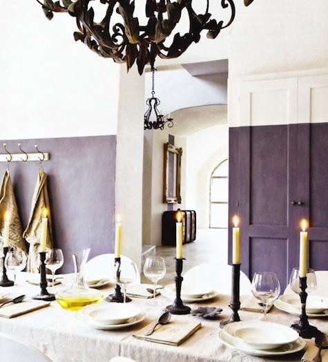
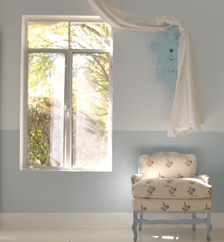
For a recent E-decorating project in Chicago we decided to do bold two tone walls in the master bedroom. The space needed an injection of color and a bit more architectural interest and this was a really cost effective way to get there! It works in a variety of rooms {as you can see below!} but I particularly love the idea of the two tone wall behind a bed. I hoped it would ground the otherwise pale space and create a great visual backdrop for the headboard. For this project I selected the warm neutral China White for the top portion of the walls and the smoky rose terra-cotta color Santa Fe Pottery for the base. In this case, the color switch happens 40" off the floor, but it really depends on the furniture and architecture of your space. The client's painter is coming soon and I am really excited to see a photo of the finished product! 


Do you like the two tone wall concept?  


The first image was my original inspiration shot for the two tone wall in this project, but these others are really lovely too. This soft blue on the last shot just makes the whole space dreamy! 

{images via}

sb signature

Greige Paint Tips: Hyphen Interiors

Wednesday, August 1, 2012

Today I am over on Hyphen Interiors along with a really lovely group of other designers and bloggers sharing my favorite greige {gray + beige!} paint color. It's an especially hard color to nail down, and it can easily go purple, greenish or just look blah. So if you are in the market be sure to visit here and seeing everyone's tried and true favorites!  

Thanks so much for having me Kristy! 


A sneak peak of my favorite greige in a project in Brooklyn. . . .

sb signature

Color + Color = Neutral?

Monday, April 23, 2012


 I love to layer color and to incorporate many tones and shades of the same hue in one space.  Somehow, lots and lots of the same color can almost feel like a neutral. It certainly is not logical, but sometimes great design just is not!  Instead of using color as a pop, here are some examples of bold interiors that went all the way. 

Do you think this crazy equation works? 


So rich and vibrant! Not sure I could live in these spaces but they are wonderful to admire. I adore that purple, plum and lavender sitting room!


{via 1. 2. 3. 4. 5}

sb signature
Related Posts Plugin for WordPress, Blogger...

Social Icons

CopyRight © | Theme Designed By Hello Manhattan