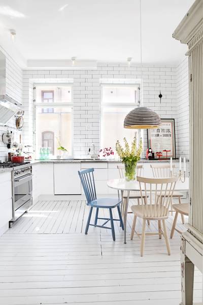
Here are a few design tips to take away from this homey flat:
{1} Whitewash your palette. Picking a soft color scheme, anchored by lots and lots of white, highlights all the natural light. Plus, by using one main color throughout, the rooms all flow together and give the impression of a larger space.
{2} Hang your window treatments extra high. Even if you windows are lower, the visual height of the curtains draws your eye up and makes the room seem even taller!
{3} Don't overcrowd! This apartment is not too full of furniture and by allowing the pieces to breath, the whole interior feels more spacious.
Also, I just have to note the adorable nursery! I wonder who makes that amazing printed ballon fabric?
{All images via}


2 comments:
Yes, I think you have picked up on a definite trend change. French is out, out, out, it would seem. All that Paris stuff - suddenly it is nowhere to be seen. Perhaps the simplicity and clean lines of Scandinavian is in contrast to all the pretty French style?
I love that bedroom, so simple yet very elegant! I think there is still an element of French style, mostly in furniture, which is being incorporated into more Scandinavian style interiors. So you end up with a French chair, painted white in a very simple white room - and I love that mix of styles!
Post a Comment